
Learn how Visme will change the way you create stunning content.
Reserve your seat
Statistics visualized with icons and other graphic elements have a unique way of turning otherwise hard-to-process information into bite-sized, engaging figures, but not everyone has the time or resources to create these from scratch using traditional graphic design software. This is why Visme launched a cool pictograph maker that allows you to translate statistics into visual representations and even create bar charts using icons.
1
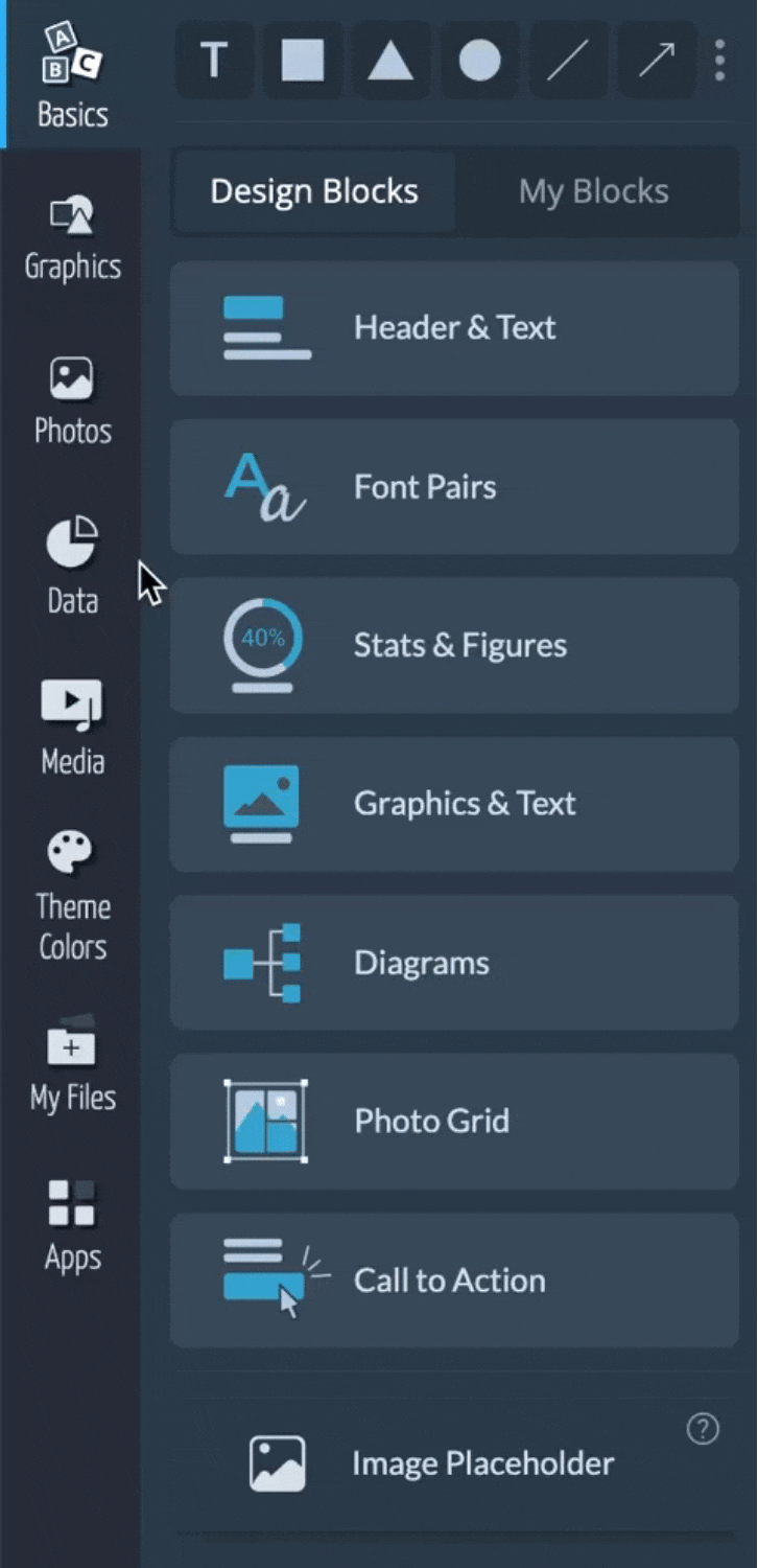
From the editor window of you project, click on the Data tab located at the left-side of the screen. Once that is done, access the Data Widgets section.
2
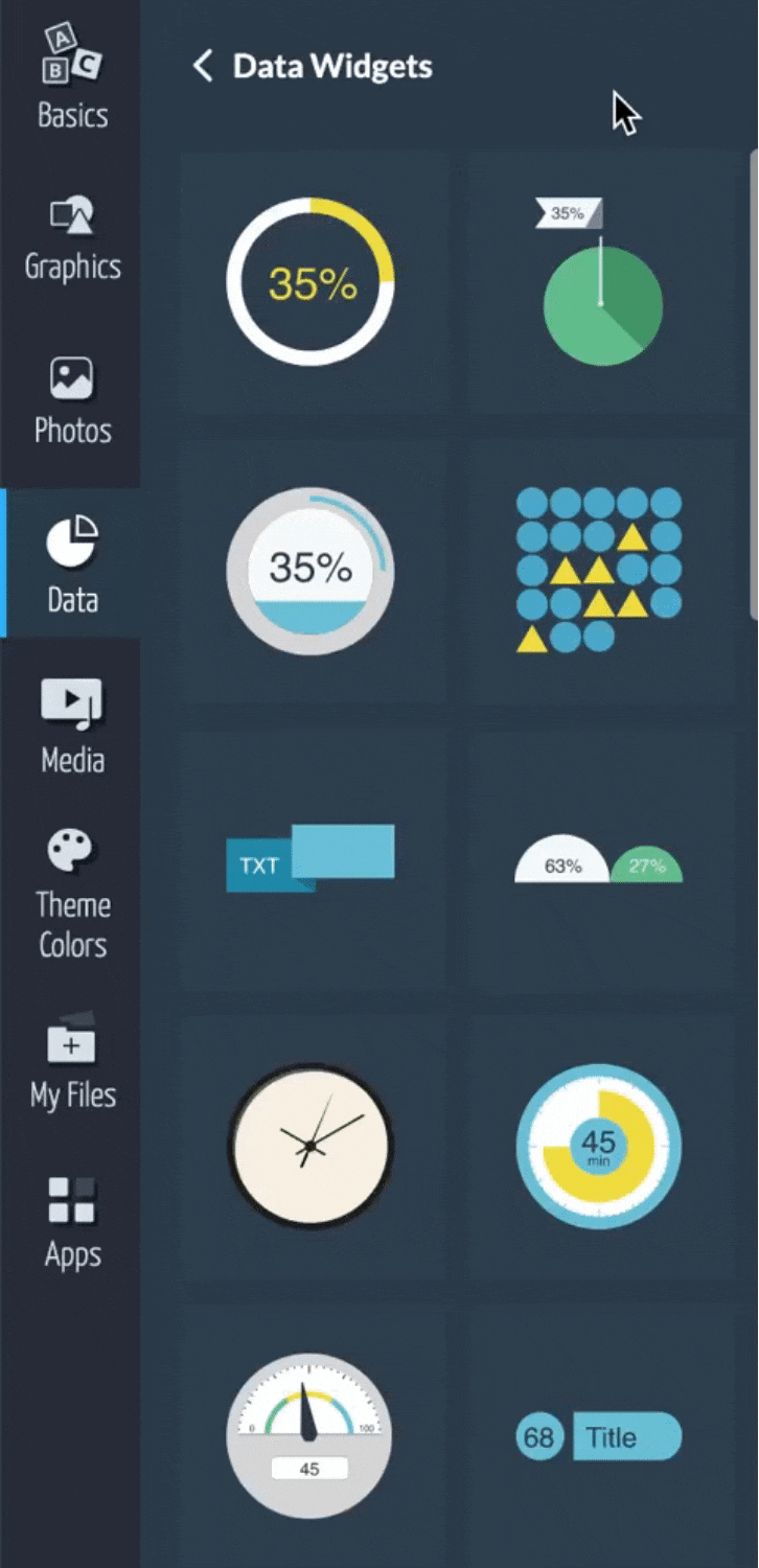
Different types of Data Widgets will appear for you to select from. Select Array and place it in your project by simply clicking on it or dragging and dropping it into place.
3
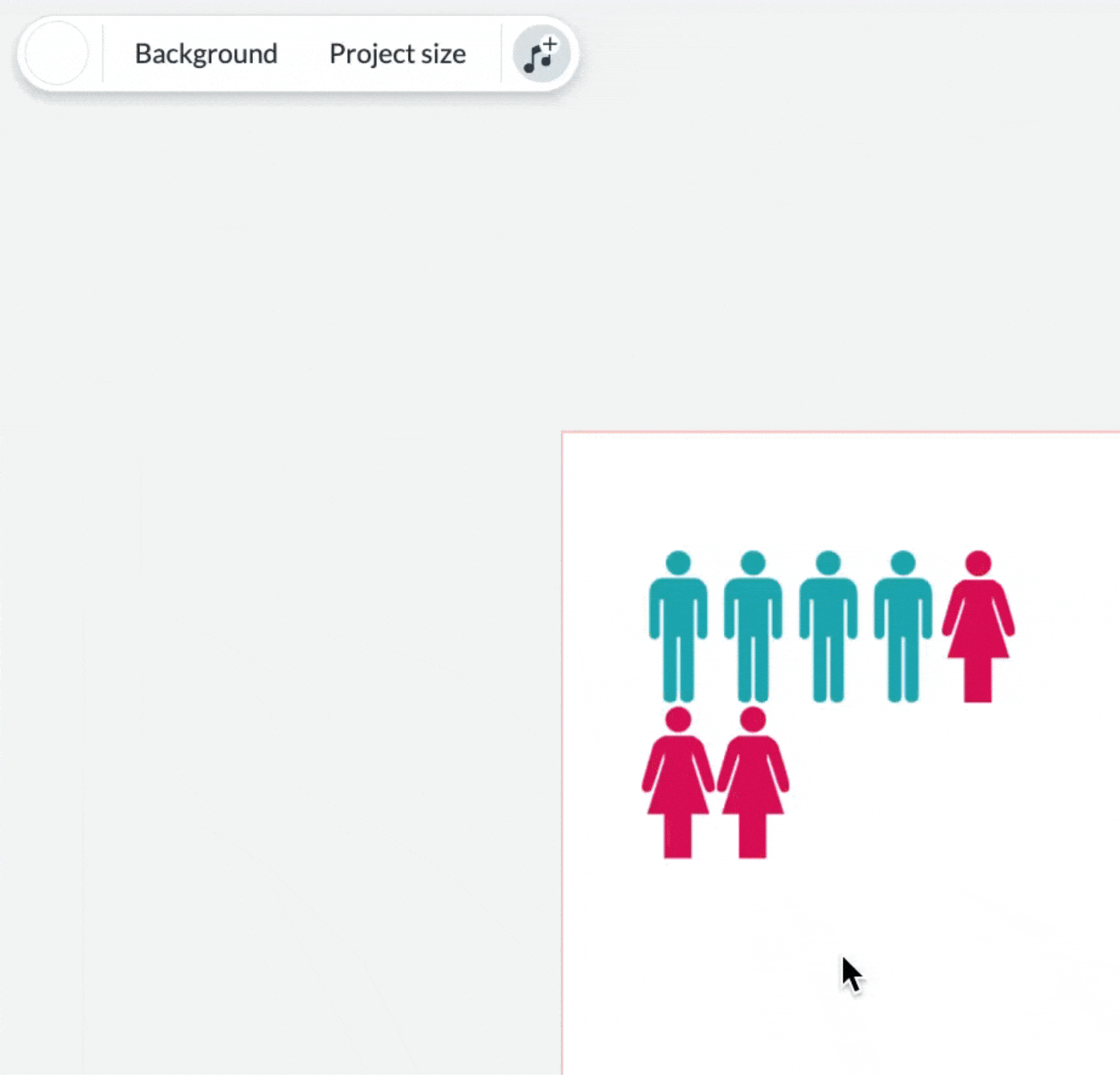
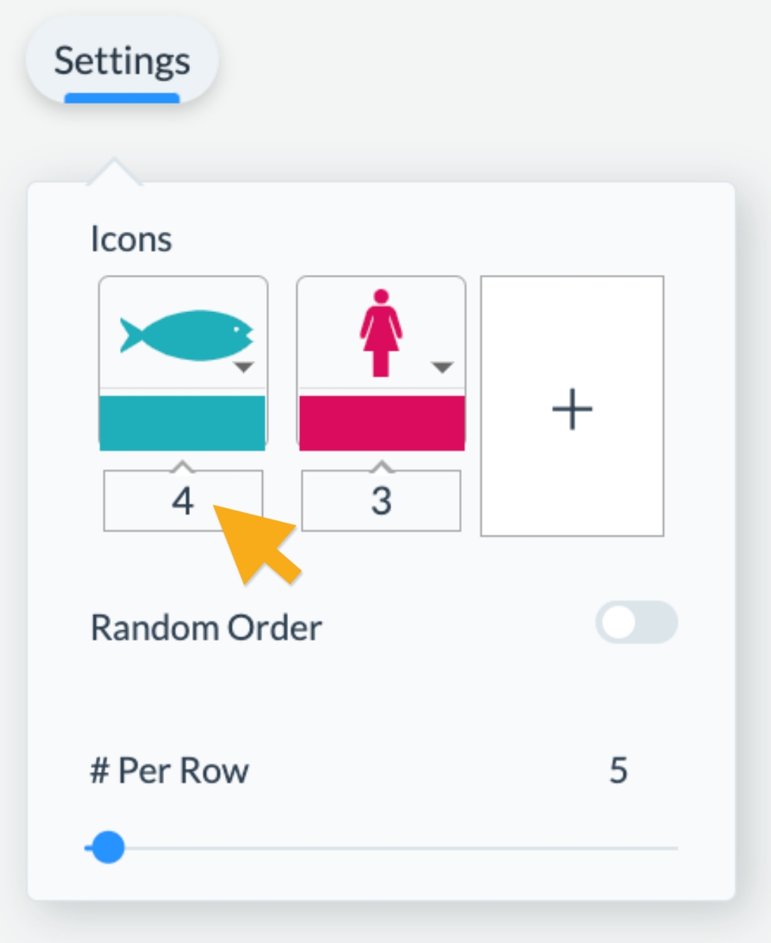
Select the array and navigate to the Settings Tab at the top left corner. Then, click on the Arrow next to each of the icons and type in a Keyword in the Search Bar to search for your desired icons. Once you’ve found the perfect icon to represent your information, simply click on it to insert it into your array.
4
Use the boxes below the icons to insert the total number of each population.
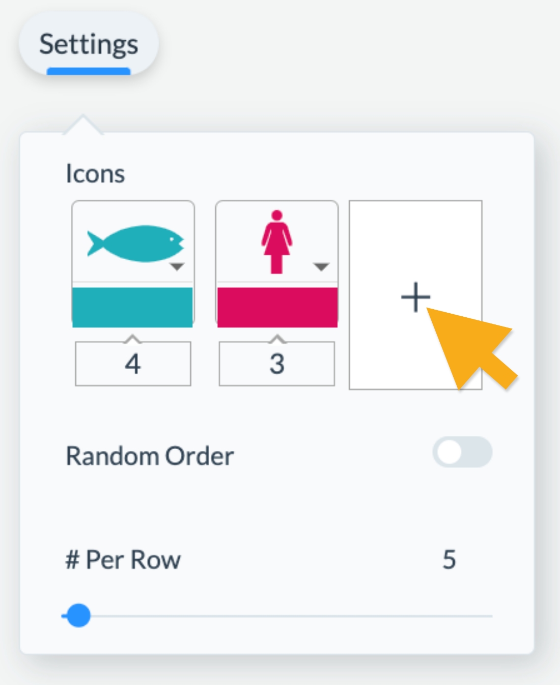
5
If you have three different segments of a population to visualize, you can insert a third icon by clicking on the Plus Sign to the right of the second icon and follow the same steps as above.
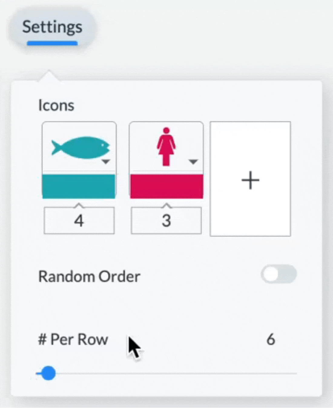
6
Depending on how you want to display your information, you can adjust the number of Icons per Row. If you want to make your array wider, simply increase the number of icons per row by manually inserting the number or adjusting the slider.
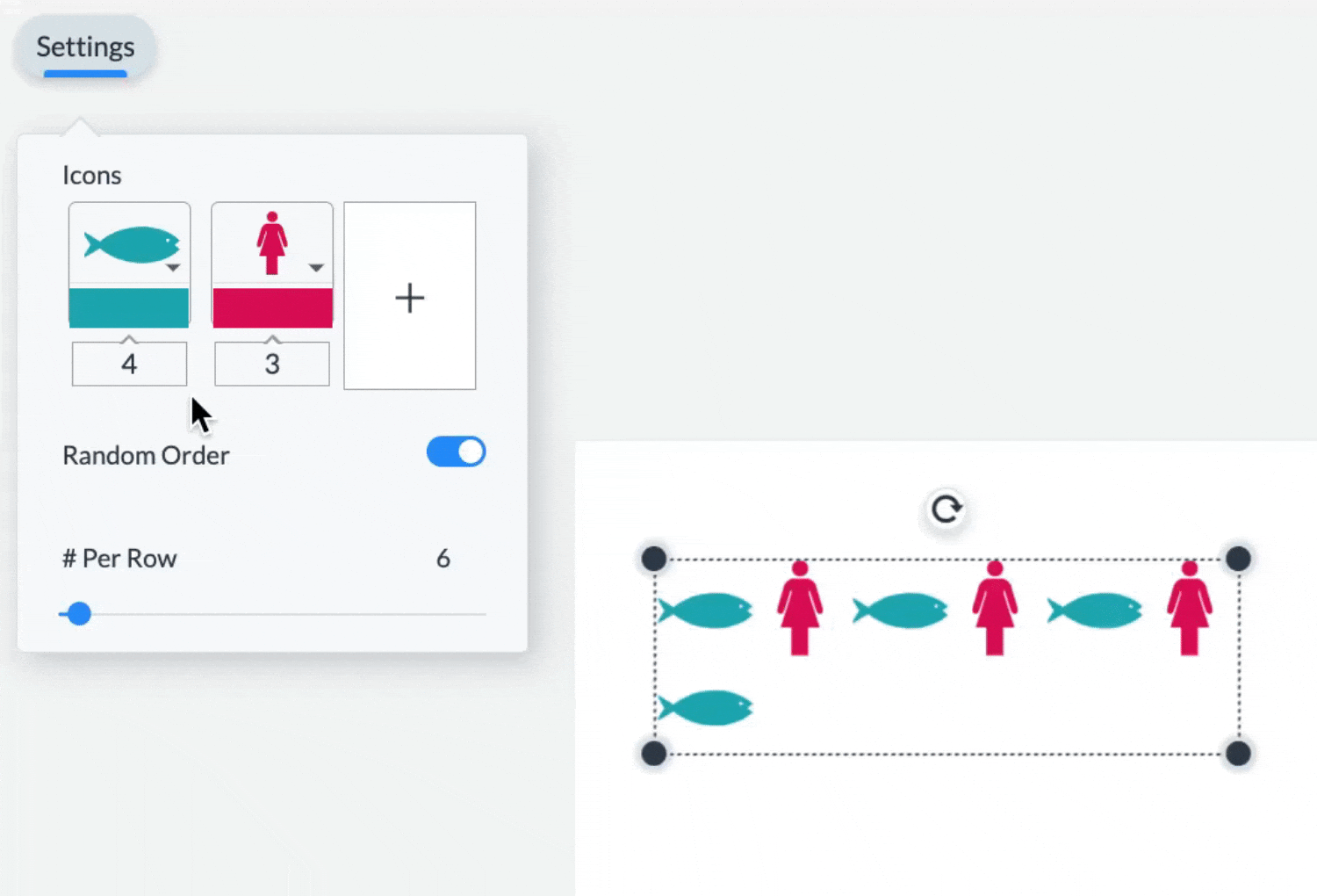
Note: If you want to create a pictograph, rather than an array, you can select your row of icons and copy them by clicking on the Duplicate button to the top-right of your screen. You can do this as many times as you like, depending on the number of rows in your icon-based bar chart, and then customize each following the steps detailed here.
7
You can change the Colors of your pictograph or icon array by clicking on the color swatch below the icon and either selecting from one of your previously used colors or choosing from any of the color presets available within Visme.
8
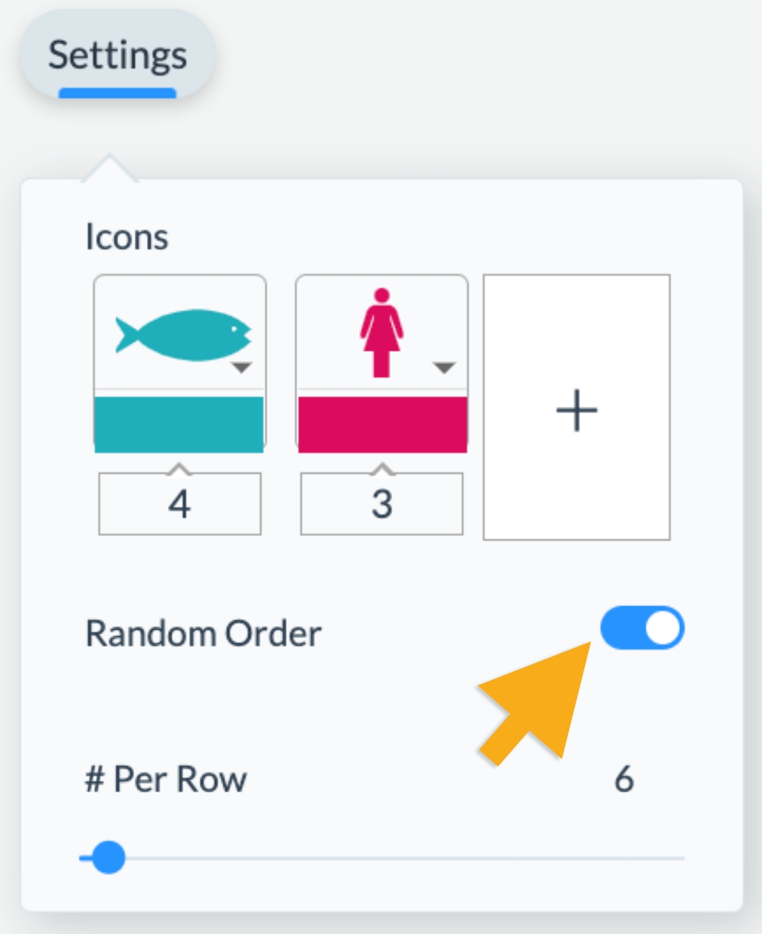
You also have the option of randomizing the order of icons, in cases where you want to display a group of various icons but not in a clearly segmented fashion. Simply activate the Random Order switch above the slider in your pop-up window.
- The Basics
- Getting Started
- Visme Community
- Visme Plans
- 5 reasons why you should use Visme
- Visme Mac Desktop App
- Visme Windows Desktop App
- What can I create with Visme?
- Who uses Visme?
- Account & Plans
- How to update your Profile Information
- The Visme Community
- Cancelling your Premium Subscription
- Visme Languages
- Visme Storage Limits
- How to reset your Visme account password
- Manage Subscription Settings
- Where can I view my Payment History and Receipts?
- Update your Payment Information
- How to delete my account?
- Publish & Present
- Shorten URL
- Find & Copy a Visme Project Link
- Allow Viewers To Download Published Projects
- How to present your content
- Share your Visme project privately
- Managing advanced settings for Visme projects
- How to present offline to an audience
- Sharing & Publishing my Visme
- Enterprise Plans
- Request team members to enable 2-Step Verification
- Link Expiration
- Elevate Your Brand with a Custom Subdomain on Visme
- Setting up Your Single Sign-On with Visme
- Secure Your Visme Account: Activate 2-Factor Authentication
- Premium Support for Enterprise Plan Users at Visme
- Enterprise Plans: Allowed Sizes, Limits, and Formats
- Embed & Download
- Download your designs in PNG format with transparent background
- Download presentations as PDFs with Presenter Notes
- Download your project as a PDF
- How to embed a website in a Visme project
- LMS Export for your Training content
- Downloading as HTML5
- How to download your project as GIF
- How to download your project in editable PPTX format
- How to download your project as Video
- Download infographics as multiple pages
- For Print
- Creating & Editing 101
- How to Import a PDF into Visme
- Resize or Adjust Your Designs in Visme
- Adding graphics to your projects
- Allowed Sizes, Limits and Formats
- Resizing the Canvas Size
- How to duplicate a Project
- How to use Basic Content?
- Importing PowerPoint Projects into Visme
- Saving your Visme Projects
- How to create a New Project
- Common Questions & Answers
- Whitelisting a blocked Domain in Visme
- Emojis appear differently after being downloaded or printed
- User Accounts and Access Recovery
- Mastering AI Communication: Tips for Effective Prompts
- How to gather a HAR file
- Why Troubleshooting is Necessary
- Accessibility and Visme
- How to contact the Support Team
- Can I get a refund for my Visme subscription?
- Troubleshooting in Visme
- Project Types
- Presentations
- How to Create a Webinar Presentation in Visme
- How to Create a Marketing Presentation in Visme
- How to Create a Training and Education Presentation in Visme
- How to Create a Results and Reporting Presentation in Visme
- How to create a Sales Proposal in Visme
- Create a Stunning Presentation in 5 Minutes
- How to Create a Pitch Deck Presentation in Visme
- Types of Content you can create using a Presentation format in Visme
- Creating Business Presentations using Visme
- How To Mix & Match Slides or Pages In Your Design
- Social Graphics
- Documents
- Creating Manuals in Visme
- Creating White Papers in Visme
- Creating Newspapers in Visme
- Creating Proposals in Visme
- Creating eBooks in Visme
- Creating Plans in Visme
- Creating Newsletters in Visme
- Creating Reports in Visme
- Creating Catalogs in Visme
- Creating Workbooks in Visme
- Infographics
- Charts & Graphs
- Charts & Graphs Settings
- Dual Charts
- How to embed Tableau Graphs and Charts into Visme
- How to make a flowchart
- Importing Data Into Charts & Graphs
- Charts and Graphs
- Whiteboards
- Videos / GIFs
- Printables
- Custom Size
- Designing & Editing
- Designing with AI
- How to Use the ChatGPT App with Visme
- Get AI suggestions when replacing images
- How to use Edit with AI feature
- Using the AI Text-to-Speech Generator in Visme
- Increase images size using the Upscaler feature
- Unblur Images with Visme
- Background Remover
- Erase & Replace objects from an image
- Resize or Adjust Your Designs in Visme
- Visme AI Designer
- Data Visualizations
- Text & Text blocks
- How to apply the Arched Text Effect in Visme
- How to change fonts across the entire project in one click
- How to add Alternative Text to objects in your Visme project
- Applying a Text Mask Effect
- Quickly Change Text Format in Visme
- How to Edit Multiple Text boxes at once
- Checklist Maker
- How to Annotate your Text
- Text Effects
- Font Pairs
- Interactivity
- Create Interactive Content in Visme
- How to create a pop-up effect
- Link To Another Slide
- Link to a Visme Project, Website, Email or Social Media
- Interactivity 101
- 3D Graphics
- How to add and use 3D Scenes & Objects in your Visme project
- Using Visme’s 3D Data Widgets
- Using 3D Characters in your Visme Projects
- How to Customize 3D Characters’ Poses
- How to use 3D Animated Graphics in Visme
- 3D Graphics
- Images
- Image Editing: Visme’s Touch-Up Tools
- How to instantly upload images with a URL
- Add photos taken with your computer camera
- Image Placeholders
- How to create Mockup Designs in Visme
- How to change the angle of your Images
- Photo Grids
- Using Photo Filters
- Framing photos
- Cropping or resizing photos
- Animations
- Text Animations
- Animation Timeline: Audio & Recording Settings
- Animation Timeline: Advanced Tab Overview
- Animation Timeline: Basic Tab and Preview Overview
- Custom Animations
- On Click Animations
- Animation tips – Do’s and Dont’s
- Animations 101 – Learn to animate
- Video
- Tables
- Connect a Visme table to live Data
- Prefilled Tables
- Embed Tables within your Visme Projects
- How To Merge Cells Within A Table
- Adding Content To Tables
- Formatting and Styling Tables
- Inserting Tables
- Audio and Music
- Add an audio recording to any object
- Using the Audio Library
- Adding background music
- Customizing audio settings
- Uploading and Inserting Audio
- Graphics, shapes and icons
- Drop Shadow Effect
- Snap to Objects
- Color Dropper Tool
- Using Animated Graphics
- Insert a Visme Graphic into an Email or Newsletter
- How to Change Object Colors
- Format Lines
- Adding and removing shapes and lines
- Resize & Format Shapes
- Searching/Replacing shapes and Icons
- Backgrounds
- Adding Background Videos
- Adding a Background Image
- How to remove the background of your images
- Using Gradient and Pattern Backgrounds
- Customizing backgrounds
- Tips for using background images
- Collaboration and Team Features
- Workflows
- Manage Tasks with Visme’s Content Calendar
- How to approve a project
- Assign an approver to your project
- How to require a user to gain project approval
- Visme Workflow Overview
- How to assign an entire project to a team member
- My Brand
- Brand Area for Managing Multiple Clients: Tips & Tricks
- How to set up your Brand Area in Visme
- Brand Wizard
- Branded Templates
- Brand Settings
- Brand Styles
- Brand Links
- Brand Templates
- Brand Assets
- Create Custom Theme Colors
- Team & Workspaces
- Allow your team to add slides from other branded templates
- Commenting on Visme Projects
- Getting comments and feedback on your Visme Project
- Commenting anonymously on Visme Projects
- Enabling Anonymous Comments on Your Visme Project
- How to update the Workspace Name
- Workspace Audit Log
- How to join a Visme Workspace
- How to add new users to your team
- Your team in Visme – How to collaborate together
- Apps and Integrations
- Visme Integrations: Visme + Monday.com
- Visme Integration: Visme + Vidyard
- Visme Integration: Visme + Wistia
- Visme Integration: Visme + YouTube
- Visme Integration: Visme + Vimeo
- Visme Integration: Visme + Livestorm
- Visme Integration: Visme + LearnWorlds
- Visme Integration: Visme + Brandfetch
- Visme Integration: Visme + Formstack
- Visme Integration: Visme + MailChimp
- Analytic Tools & Insights
- Analytics
- Registration Form Results
- Deeper Analytics
- Analytics – Tracking traffic & statistics of projects
- Registration Form
- Tips & Tricks
- Account & Projects Settings
- How to View Project Details and Add Labels in Visme
- Slide Progression Control Feature
- Folder Sharing | FAQs
- How to duplicate project folders
- How to log out of your Visme account
- Hiding control bar on published projects
- Viewing and Presenting
- Creating and Designing
- How to activate Closed Captions in your Visme project
- Visme AI Designer
- Trim View
- Create faster with Shortcuts
- Using Find & Replace
- Creating Interactive eBooks
- Visme Ruler & Smart Guides
- Coordinates Panel
- Objects List
- Zoom In & Out
- Productivity Tools
- My Blocks
- How to Create and Manage Folders in ‘My Blocks’
- How to Manage Block Settings in Visme
- How to insert a block into a Visme project
- How to create a Block in Visme
- Tools & Features
- Time Yourself when Presenting with the Timer Feature
- Visme AI Designer
- Visme AI Writer
- Drawing Tool
- AI Image Generator
- Interactive Xperience
- XLIFF Localization Feature
- Design on the go with Visme iOS App
- Workflow Management: Assign projects or slides to your team
- Spell Checker
- My Files
- My Files: Using folders and labels
- My Files: Settings
- My Files: Overview & How to Access
- My Files: How to manage your assets
- Grides & Guides
- Slide Library & Content Blocks
- Forms & Surveys
- Getting Started with Visme Forms
- Types of Forms you can create using Visme Forms
- Getting Started with Visme Forms
- Visme Forms FAQs
- Visme Forms vs Traditional Forms
- Sharing and Embedding your Visme Form
- How to embed Visme Form to a Shopify website
- How to embed a Visme Form on Squarespace
- How to embed a Visme Form on Webflow
- How to embed a Visme Form on Wix
- How to embed a Visme Form on WordPress
- Embedding Visme Forms
- Sharing and Publishing Visme Forms
- Sharing Visme Forms – Publishing and Embedding
- Maximizing Visme Forms
- Design your Form
- Adding Videos & Images to your Visme Form
- Customize Your Visme Form Design and Media
- How to create a Multi-Step Form in Visme
- How to create Single-Page Forms
- How to Add a Country question to Your Visme Form
- How to Add a Time Question to Your Visme Form
- How to Add a Rating question to Your Visme Form
- How to Add an Appointment Question to Your Visme Form
- How to Add a Date Picker Question to Your Visme Form
- How to add Short and Long answers questions to your Visme Form
- Data Collection and Management
- What happens when a Form is submitted?
- Analyzing Visme Forms Performance
- How to collect and sync Data across different Applications
- Forms Integrations
- Forms Integrations: Visme + Zapier
- Forms Integrations: Visme + GetResponse
- Forms Integrations: Visme + Klaviyo
- Forms Integrations: Visme + ConvertKit
- Forms Integrations: Visme + Airtable
- Forms Integrations: Visme + Brevo
- Forms Integrations: Visme + ActiveCampaign
- Forms Integrations: Visme + Google Sheets
- Forms Integrations: Visme + HubSpot
- Forms Integrations: Visme + Mailchimp