
Learn how Visme will change the way you create stunning content.
Almost all reports in Google Analytics are displayed in the form of tables which at times do not convey enough information to be able to see actionable insights. The good news is that with Google Analytics integration in Visme, you will be able to quickly visualize your Google Analytics data into beautiful and interactive charts.
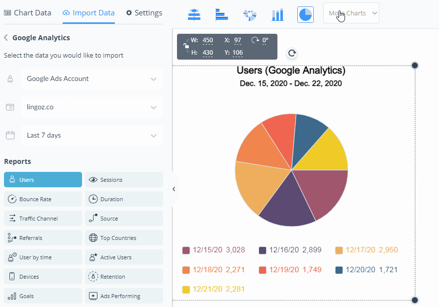
1
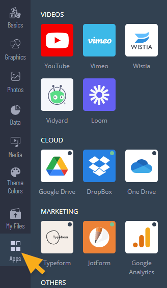
In the Visme editor, click Apps from the left panel.
2
From the Apps tab, click Google Analytics app and then click Connect. You will be prompted to grant Visme access to your Google Analytics data.

If you don’t have a Google analytics account, you can create one here.
3
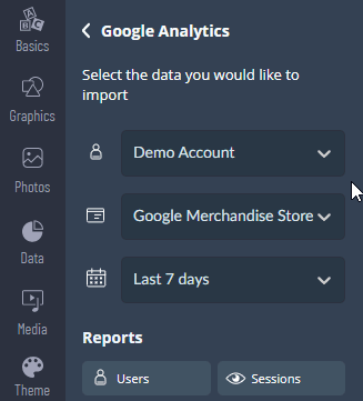
Choose your Google Analytics account, Property and the Date-Range of your reports.
4
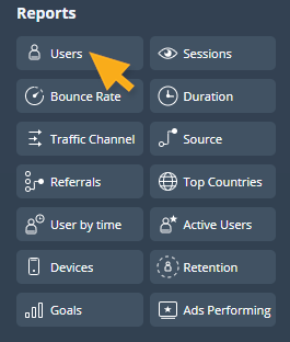
Under the Reports section, select a report that you would like to visualize.
5
A chart will be automatically generated with your Google Analytics data.
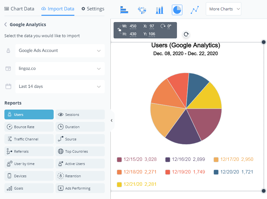
6
You can change the type of chart, data range and report type at any time.
Under the Chart Settings, you have the advanced chart settings which you can adjust as needed, more about Visme charts here.
- The Basics
- Getting Started
- How to Access and Use the Visme Referral Program
- Joining the Visme Community to Learn, Share and Grow
- Visme Plans Overview: Features and Pricing for Every Need
- Exploring why you should use Visme
- Installing the Visme Mac Desktop App
- Installing the Visme Windows Desktop App
- Exploring what you can create in Visme
- Discovering how Visme supports different roles
- Account & Plans
- Managing Your Visme Account Settings: Profile, Login, Security, and Notifications
- How to Cancel Your Visme Subscription (Web, iOS & Android)
- How to Change the Language in Visme
- Understanding Visme Storage Limits to maximize your space
- Resetting your Visme Password quickly and securely
- Subscription Settings: How to Upgrade, Manage, and Cancel Your Visme Plan
- Billing: How to View and Download Your Payment Receipts
- How to Update Your Payment Information in Visme
- How to Delete Your Visme Account
- How to Unsubscribe from Visme Emails and Newsletters
- Publish & Present
- Optimizing Visme Published Projects for Search Engines
- Generating Short URLs for Easy Sharing
- Getting a shareable link for your Visme project
- Allowing viewers to download published projects
- Sharing your Visme project with specific people
- Managing Advanced Settings to customize Visme projects
- How to Publish and Share Your Visme Project Online
- Enterprise Plans
- Applying Text Box Locks to Protect Your Design
- Understanding Custom Roles in Visme
- Assigning Custom Roles to your team
- Requesting Team Members to Enable 2-Step Verification for Security
- Setting Link Expiration to Limit Viewer Access
- Setting Up a Custom Subdomain to Strengthen Your Brand
- Configuring Single Sign-On (SSO) for Added User Account Protection and Security
- Activating 2-Factor Authentication to Secure Your Visme Account
- Accessing Premium Support with Visme’s Enterprise Plan
- Understanding Size and Format Limits in Enterprise Accounts
- Embed & Download
- How to Download Your Visme Project as HTML5 for Offline Use
- Optimizing Visme Published Projects for Search Engines
- Embedding Online Content using a URL
- Using iFrames to Embed Online Content
- Embedding Online Content using URL, HTML, or iFrame
- Downloading Designs as Transparent PNGs
- Downloading Presentations as PDFs with Presenter Notes
- How to Download Your Visme Project as a PDF
- Embedding External Online Content Using HTML
- Exporting Training Content to your LMS
- For Print
- Downloading your project for high-quality printing
- Downloading Your Visme Design for Print
- Enabling Crop Marks and Bleed in your Downloads
- Creating & Editing 101
- Using Graphics to create engaging projects
- Importing PDFs to Customize Content
- Resizing designs quickly with AI Resize
- Adding graphics to your projects
- Reviewing Size Restrictions and Format Options
- Resizing the Canvas Size to fit your content
- Making a duplicate of a Visme Project
- Adding basic content elements to your project
- Importing PowerPoint Projects into Visme
- Common Questions & Answers
- How Visme Uses Cookies in Published and Embedded Projects
- Allowing Blocked Domains in Visme Settings
- Fixing Emoji Display Issues in Visme Exports
- Recovering your Visme Account access
- Creating clear AI prompts for accurate results
- Gathering a HAR file for Technical Troubleshooting
- Using troubleshooting to identify and fix issues
- How to Contact Visme Support: Chat, Email, and Self-Service Resources
- Refunds and Visme Subscription Terms & Conditions
- Resolving issues with easy troubleshooting
- Project Types
- Presentations
- Creating a Webinar Presentation in Visme
- Creating a Marketing Presentation in Visme
- Creating a Training and Education Presentation in Visme
- Creating a Results and Reporting Presentation in Visme
- Creating a Sales Proposal in Visme
- Creating a Stunning Presentation in 5 Minutes
- Creating a Pitch Deck Presentation in Visme
- Using Presentation format to create content in Visme
- Creating Business Presentations using Visme
- Combining Slides and Pages to Build Your Design
- Social Graphics
- Documents
- Creating Manuals in Visme
- Creating White Papers in Visme
- Creating Newspapers in Visme
- Creating Proposals in Visme
- Creating eBooks in Visme
- Creating Plans in Visme
- Creating Newsletters in Visme
- Creating Reports in Visme
- Creating Catalogs in Visme
- Creating Workbooks in Visme
- Infographics
- Charts & Graphs
- Using 3D Charts to Visualize Data
- Adding a second Y axis to Charts
- Customizing Charts Settings
- Using Dual Charts to compare Data
- Designing a Flowchart to visualize processes
- Populating Charts with imported Data
- Visualizing Data using Charts & Graphs
- Whiteboards
- Videos / GIFs
- Printables
- Microsites
- Managing Desktop and Mobile Versions in Visme Microsites
- Adding and managing Sections in your Webpage
- Customizing the Header on Your Webpage Project
- Using Visme to make Microsites
- Designing & Editing
- Designing with AI
- Saving time by reusing content with AI Designer
- Using the ChatGPT App to create content
- Getting smart Image Suggestions with AI
- Using AI to customize Templates
- Converting Text to Voice Using AI
- Increasing image size without losing quality
- Removing Blur from Image using AI
- Removing Image Backgrounds
- Erasing and Replacing Objects from an image
- Resizing designs quickly with AI Resize
- Data Visualizations
- SmartBlocks: How to Build Structured Grid Layouts in Visme
- Using 3D Data Widgets to visualize complex Data
- Visualizing Data using Data Widgets
- Customizing Charts Settings
- Using Dual Charts to compare Data
- Designing a Flowchart to visualize processes
- Using Pictograph and Arrays
- Populating Charts with imported Data
- Creating an interactive map for better visualization
- Visualizing Data using Charts & Graphs
- Text & Text blocks
- Using Truncate Text to Protect Your Design Layout
- Customizing Closed Captions to improve accessibility
- Customizing Text with Arched Effect
- Changing fonts across the entire project in one click
- Using Alternative Text to improve Accessibility
- Applying Text Mask Effect to enhance designs
- Customizing Text Format to match your style
- Editing multiple text boxes at once to save time
- Building Checklists to track progress
- Annotating Text to highlight key information
- Interactivity
- Linking objects to navigate to another project
- Creating Interactive Content to Engage Your Audience
- Adding Audio into Objects to Enhance Interactivity
- Adding Audio into Objects to Enhance Interactivity
- Hotspots: How to Create Pop-Up Effects on Any Object in Visme
- Linking objects to navigate between Slides
- Adding External Links to Objects
- 3D Graphics
- Adding 3D Scenes & Objects to bring content to life
- Using 3D Data Widgets to visualize complex Data
- Adding 3D Characters to your projects for visual appeal
- Customizing 3D Character Poses to match your story
- Using 3D Animated Graphics for dynamic projects
- Adding 3D Graphics to enrich your designs
- Images
- Adding Carousels to showcase multiple images or videos
- Adding Image Captions to Provide Context
- Erasing and Replacing Objects from an image
- Using Touch-Up Tools to Edit Images
- Creating Custom Images Using AI Image Generator
- Uploading Images Instantly via URL
- Upload photos using your computer’s camera
- Using Image Placeholders to Apply an Image at Scale in a Project
- Creating Mockup Designs to Display Ideas
- Adjusting image angles to fit your design
- Animations
- Using the Animation Timeline to Control Your Project
- Animating Text to Engage your Audience
- Managing Audio and Recording Settings via Animation Timeline
- Using Custom Animations for Unique Visual Effects
- Using On Click Animations to Control Interactivity
- Animation tips – Do’s and Dont’s
- Animations 101 – Learn to animate
- Video
- Splitting Videos for Engaging Projects
- Trimming Videos for Engaging Projects
- Customizing Video Settings for Interactive Projects
- Adding, Uploading, & Embedding Videos
- Tables
- Connecting Tables to Live Data Sources
- Using Prefilled Tables for Fast Creation
- Embedding Tables to Organize Information
- Adding Content Manually to Tables to Organize Your Data
- Formatting Visme Tables to Improve Visual Appeal
- Inserting Tables to Organize Your Data
- Audio and Music
- Editing Audio Settings to Match Your Needs
- Adding Voiceovers to Improve Project Engagement
- Recording Audio in Visme for Your Projects
- Adding Audio to your Visme project
- Using an Audio from Visme’s Library
- Adding Background Music to your Visme Project
- Uploading your own Audio File in Visme
- Graphics, shapes and icons
- Creating Drop Shadow Effects for Visual Depth
- Using Snap to Objects to Align Elements
- Using the Color Dropper Tool for Precise Color Selection
- Using Animated Graphics to Engage Viewers
- How to Change Object Colors in the Visme Editor
- Customizing Line Styles in Visme
- Adjusting Shape Size and Format for Better Visuals
- Finding and Swapping Shapes and Icons Efficiently
- Backgrounds
- Removing Image Backgrounds
- Adding Background Videos for Stronger Impact
- Adding Background Images for Visual Appeal
- Applying Gradient and Pattern Backgrounds
- Customizing Backgrounds for Better Visual Impact
- Tips for Using Background Images Effectively
- Collaboration and Team Features
- Workflows
- Using Visme’s Content Calendar to Manage Tasks
- Managing Project Approval in Visme
- Assigning an Approver a Project
- Requiring Users to Get Project Approval
- Exploring Visme Workflow for Efficient Project Management
- Assigning Projects and Slides for Efficient Workflow Management
- Assigning Projects to Team Members for Collaboration
- My Brand
- Accessing and Using the Brand Kit in Visme
- Organizing Client Brands in Visme’s Brand Area
- Getting Started with Brand Area Setup
- Using Brand Wizard to Build your Identity
- Using Branded Templates in Minutes
- Managing Brand Settings for Consistent Designs
- Setting Up Brand Links for Easy Access
- Setting Up Brand Templates for Team Use
- Organizing and Using Brand Assets
- Brand Kit: How to Create and Use Color Palettes in Visme
- Team & Workspaces
- Understanding Custom Roles in Visme
- Assigning Custom Roles to your team
- Managing User Permissions in your Workspace
- Enabling Slide Imports from Other Branded Templates
- Collaborating by Commenting on Visme Projects
- Getting comments and feedback on your Visme Project
- Giving Feedback Anonymously on Shared Projects
- Enabling Anonymous Comments on Your Visme Project
- Updating Your Workspace Name in Visme
- Reviewing Team Activity with the Audit Log
- Apps and Integrations
- Analytic Tools & Insights
- Analytics
- Collecting Contact Info with Visme Registration Forms
- Using Deeper Analytics to Track Visme Project Engagement
- Using Analytics to Track Visme Project Performance
- Collecting Contact Info with Visme Registration Forms
- Tips & Tricks
- Account & Projects Settings
- Optimizing Visme Published Projects for Search Engines
- Managing Project Details and Labels to Stay Organized
- Controlling Slide Progression to Guide your Audience
- Understanding Folder Sharing in Visme
- Duplicating Project Folders to Reuse Content Efficiently
- Logging Out from Visme on Any Device
- Hiding control bar on published projects
- Viewing and Presenting
- Hiding the Visme Logo in Your Published Projects
- Using the Flipbook Effect to Present Documents Dynamically
- Using a Presenter Pointer to Engage your Audience
- Creating and Designing
- Activating Closed Captions to Improve Accessibility
- Generating Visual Content with Visme AI Designer
- Using Trim View to Organize Design Elements
- Using Shortcuts to Speed Up Your Project Creation
- Using Find & Replace to Quickly Edit Text
- Creating Interactive eBooks
- Using Ruler & Smart Guides to Align Your Designs
- Using the Coordinates Panel to Adjust Element Size and Position
- Using the Objects List to Organize Design Elements
- Creating & Designing Emails In Visme
- Productivity Tools
- My Blocks
- Creating and Managing Folders in ‘My Blocks’
- Creating and Saving Your Own Blocks
- Inserting a Block to Build Projects Faster
- Creating Reusable Blocks for your Projects
- Tools & Features
- Managing Private Files and Folders in Visme
- Using Favorites for Projects, Folders, and Templates
- Applying Text Box Locks to Protect Your Design
- Using the Accessibility Checker in Visme
- Using the Replace Feature to Swap Design Elements
- Translating your Project Quickly and Accurately
- Using the Timer to Stay on Track when Presenting
- Generating Visual Content with Visme AI Designer
- Creating Text Content with Visme AI Writer
- Drawing Freehand Elements in your Projects
- My Files
- Organizing My Files Using Folders and Labels
- Adjusting My Files Settings for Better File Organization
- Exploring My Files and Accessing Them Efficiently
- Managing and Organizing Assets in My Files
- Grides & Guides
- Slide Library & Content Blocks
- Sharing Blocks for Your Team to Use in Their Projects
- Managing Slide Library Slides into Groups to Keep Slides in Order
- Slide Library: How to Save, Access, and Insert Slides Across Presentations
- Using Content Blocks for Efficient Creation
- Forms & Surveys
- Getting Started with Visme Forms
- Protecting User Security on Visme Forms
- Identifying and Reporting Abuse on Visme Forms
- Types of Forms you can create using Visme Forms
- Navigating Visme Forms to Collect Data Efficiently
- Answering Common Questions About Visme Forms
- Comparing Visme Forms and Traditional Forms
- Sharing and Embedding your Visme Form
- Embedding Visme Forms into Your Shopify Website
- Embedding a Visme Form on Squarespace
- Embedding a Visme Form on Webflow
- Embedding a Visme Form on Wix
- Embedding a Visme Form on WordPress
- Embedding Visme Forms for Seamless Website Integration
- Publishing Visme Forms and Sharing Them
- Sharing and Embedding Visme Forms to Collect Data
- Optimizing Visme Forms for Better Data Collection
- Make your Form
- Applying Conditional Logic in Visme Forms
- Building Multi-Step Forms for Better User Experience
- Building Single-Page Forms for Fast Data Collection
- Adding a Country Question to Your Visme Form
- Adding a Time Question to Your Visme Form
- Adding a Rating question to Your Visme Form
- Adding an Appointment Question to Your Visme Form
- Adding a Date Picker Question to Your Visme Form
- Adding Short and Long answers questions to your Visme Form
- Adding a Phone Field to Your Visme Form
- Data Collection and Management
- Adding Email recipients for Form submissions
- Explaining What Happens When a Form Is Submitted
- Analyzing Visme Forms Performance to Optimize Data Collection
- Collecting and Syncing Data Across Applications
- Style your Form
- Customizing and animating Gestures on Visme Forms
- Adding Hand Gestures to Your Form to Engage your Audience
- Building Interactive Forms with Videos and Images
- Customizing Your Visme Form Design and Media
- Redirecting Users to a URL After Form Completion
- Forms Integrations
- Forms Integrations: Visme + Zapier
- Forms Integrations: Visme + GetResponse
- Forms Integrations: Visme + Klaviyo
- Forms Integrations: Visme + ConvertKit
- Forms Integrations: Visme + Airtable
- Forms Integrations: Visme + Brevo
- Forms Integrations: Visme + ActiveCampaign
- Forms Integrations: Visme + Google Sheets
- Forms Integrations: Visme + HubSpot
- Forms Integrations: Visme + Mailchimp